
I’m a UX Researcher who designs user experiences based on all we know about people and technology. I have a Masters in human-computer interaction from Carnegie Mellon. I dive deep for creative solutions.
CHECK OUT MY PROJECTS
I’m a UX Researcher who designs user experiences based on all we know about people and technology. I have a Masters in human-computer interaction from Carnegie Mellon. I dive deep for creative solutions.

RGH Themed Entertainment.
Predicting guest behavior →

GE Healthcare
Designing for radiologists →

DIRECTV
Getting customers online →

Temptation
Designing a recipe app →

AnimalConnection
Creating immersive games →
My musings.
I love to pioneer new territory for UX. Check out my pin blog for themed entertainment and read my LinkedIn Pulse article “Want happy guests?”
My playgrounds.
I often fly to SXSW Interactive and sometimes drive down to SIGGRAPH. I’ve dropped in on TEA mixers and UX meetups. I’ve been published in CHI.
My passions.
I foster kittens and back LGBTQ rights. My band Bye Bye and the Forevers is taking over the same planet that my group Kids Stop once fought to save.
My clients.


My profiles.


My friends.


More about me.
In addition to researcher, I’m an avid sketcher, designer, indie rocker, animal lover, longtime environmental activist, and lifelong board-gamer. I used to go by “Essary”—then, bam, marriage. I currently live in Los Angeles with my wife Sarah, our dog Ora and cats Floyd and Dottie.
 wiped out rollerblading to work in a suit and tie, devoured every episode of This American Life in sequence, and scored and starred in a short silent movie about a boy who lost the ability to communicate through anything other than piano hands. He secretly admires the late Finnish author Tove Jansson.")

RGH Themed Entertainment

Experience Designer

RGH Themed Entertainment planned a unique walkthrough attraction with multiplayer games at room scale. With millions at stake, they worried that in the attraction’s current state, guests wouldn’t keep pace, the games wouldn’t hold their attention, and the experience wouldn’t bear repeating.
Providers of themed entertainment never intend to frustrate, alienate, or bore guests. But even the best creative work may fail to convince each guest in our diverse audience to buy into the story and enjoy it on his or her own terms. It has become too risky to argue that If I like it, they’ll like it. Guests are global citizens and can be pretty different!
This particular experience needed an overhaul, but nobody was sure how to measurably improve it.
Project managers asked me—how will we hold guests’ interest? How will we get them to play together as a team? How will we keep them from wandering by commanding their focus until the satisfying conclusion—when they are destined to win every time?
Overall, how can we convince guests to suspend their disbelief and then willingly and exuberantly act out predetermined responses that move the experience at operation speed?

If we want to optimize our experiences for the most fun and the least frustration, then we need to know what will be the most fun and the least frustrating for our specific guests. And if we want our guests to willingly and exuberantly act out predetermined responses, then we need to know what motivates them.
Walt Disney would get down on all fours to see his park as a child would. Today’s theme parks, zoos, aquariums and museums are intended for an even more diverse global audience. Interpreting their needs and desires requires advanced techniques in Disney’s spirit.
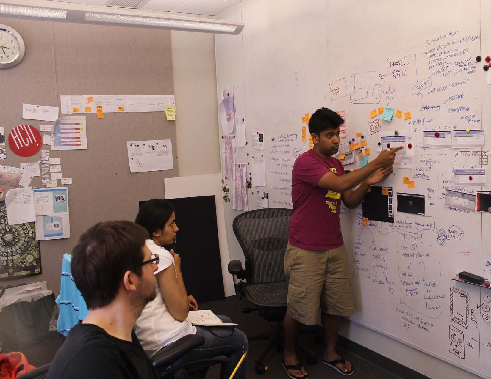
I worked many days and nights to carefully build a new vision that could firmly guide guest interaction in an open attraction. I integrated Alan Cooper’s comprehensive Goal Directed Design philosophy with Jesse Schell’s powerful game design principles. Visiting experts in game design and other designers and researchers in my department helped to iteratively refine the shape and structure of my vision. I crafted it to fit a wide range of interactions and developed advisories, presentations, and workshops that would be easily accessible to anyone who needed them.

I called my solution “Interactive Magic” because it allows us to measurably improve an interactive attraction, and because, well, M.A.G.I.C. stands for Motivation, Activity, Goal, Interaction, and Correlation—a handy mnemonic device for the preconditions to successful design. But really, Magic comprises a full set of techniques we can use in each stage of the design process to think like our guests. It helps us bring creative vision and interaction design into harmony.
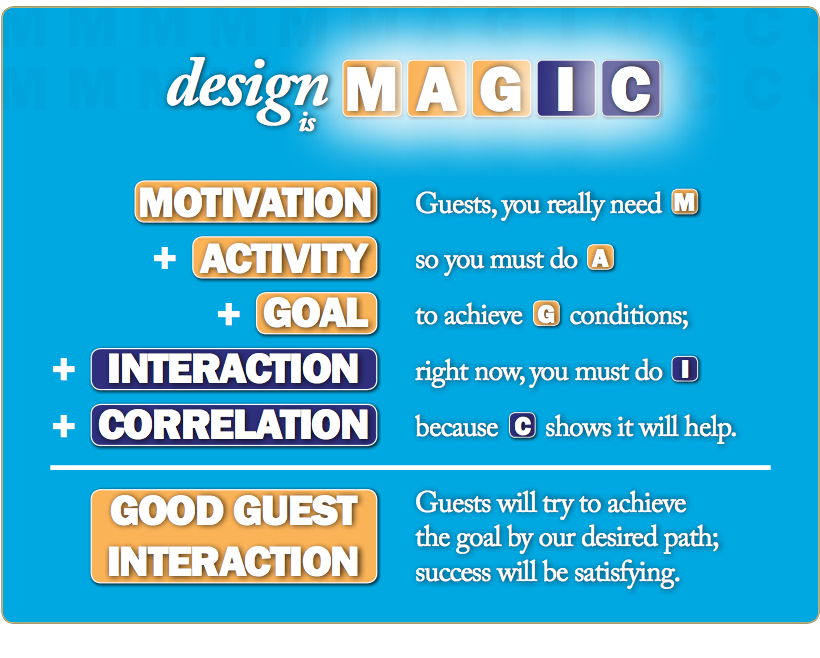
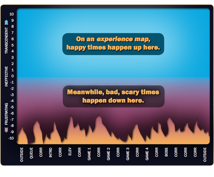
By aligning guests’ inherent motivations with a coherent story tied to gameplay, guests feel a sense of freedom while their choices fall within hidden constraints. An experience map shows improvement from start to finish—this brings a team together around a single shared vision from guests’ perspectives.
Unfortunately, my work on this attraction is still under NDA, so I’m not yet at liberty to disclose project details.
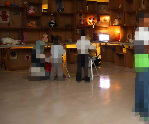
In lieu of identifying material which might violate an NDA, let me share with you some shots of a fun and informative play test we conducted on-site at a Muslim private elementary school. The school generously allowed us to invite students and their families to test a full-scale mockup of a scavenger-hunt game for one of our attractions. Much of my work at RGH involved guest research and game design just like this!
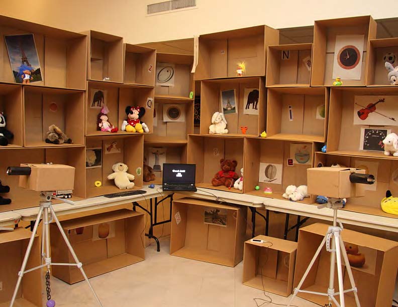 A section of the mockup (lights on)
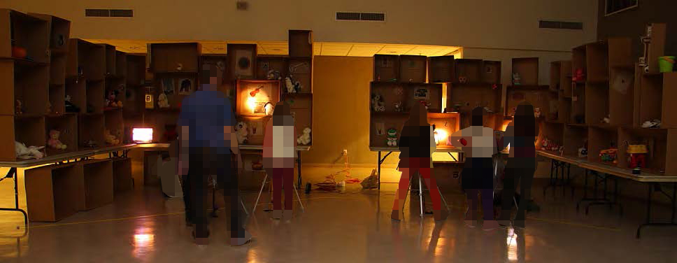 Play test goes live
 Mom coaches her young son
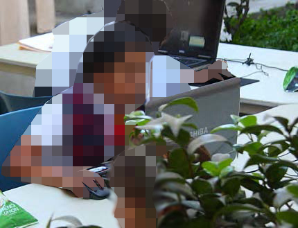 Simul-testing virtual versions
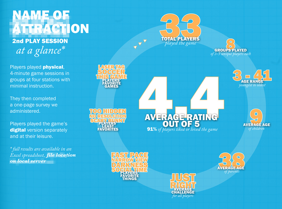 Infographic reports findings
I also ran a guerrilla study at Build-A-Bear to shed insight on design issues for a separate attraction. Boy, was that fun!
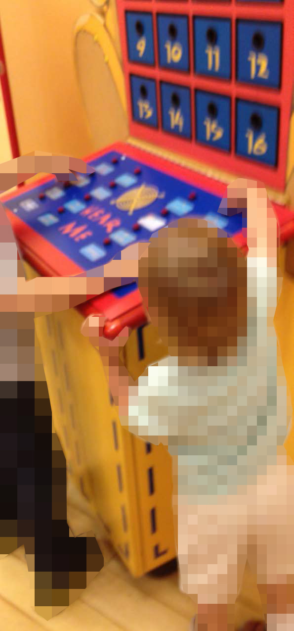 Build-a-Bear guerrilla study
In addition to Magic, I’ve repurposed, invented and implemented some other interaction design methodologies in the world of themed entertainment. It’s fun, interesting, and creatively rewarding!
The opinions expressed on this website and in its supporting documents are mine and do not represent the official position of any other party or company.
GE Healthcare
User Experience Lead
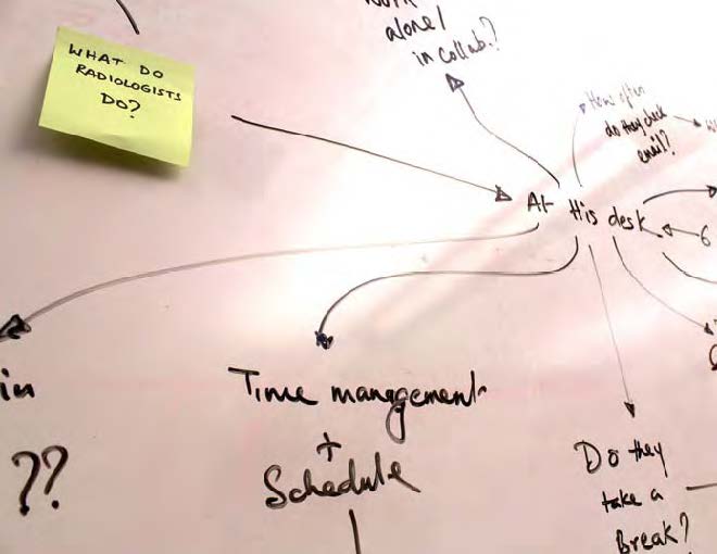
GE asked us—could we create a catch-all solution to help radiologists reduce distractions, streamline their workflow, and smoothly communicate within the radiology ecosystem? Was it feasible? Where should they even begin?
 Learning the ropes
Distraction is a huge problem for radiologists. We all know what it feels like to be interrupted all day long. But we don’t all shoulder the extra burden of making life-or-death diagnoses with a high volume of critically ill patients.
Unfortunately, in the years leading up to my team’s 2012 contract with GE Healthcare, radiologists had been growing increasingly distracted. The explosion of technology (especially smartphones) had created an expectation that they should make themselves more available. However, their work was suffering. A knock on the door, a ringing landline, a dinging cell phone—radiologists had no way to predict the rare interruption that might save a patient’s life nor which ones could be safely ignored until later.
Why not hire a receptionist? Few radiologists were willing to take that chance. A receptionist may make a bad split-second decision, underestimate the urgency of a case, or fail to deliver a timely diagnosis to a patient’s primary care physician. If this happened, the patient’s life would no longer be in the radiologist’s hands, violating the Hippocratic Oath. Radiologists needed a solution that would allow them to retain control over their communications with colleagues.
GE Healthcare was already heavily involved in the radiology market, but competitors were closing in on their lead. GE needed to beat its competitors for hospital contracts by providing more helpful solutions. They recognized that by providing a technological solution to the distraction problem, they could create a unique and lucrative market position in radiology departments across the United States. In so doing, they could also help to save countless lives by increasing the efficiency of radiologists.
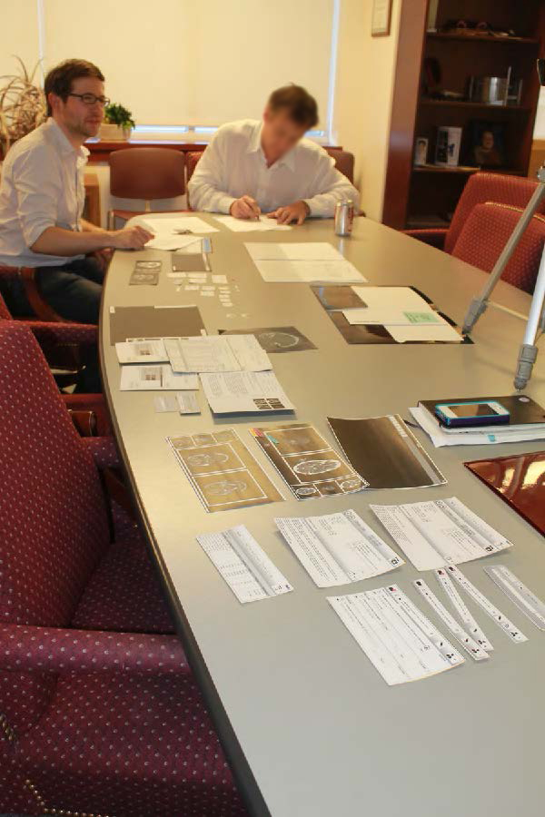
We conducted a competitive analysis and literature review to research the problem space, focusing on how radiologists communicate. Then, we conducted field research at five hospitals with 27 participants in seven different roles.
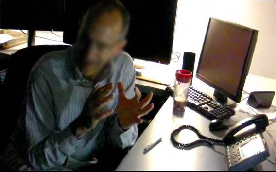
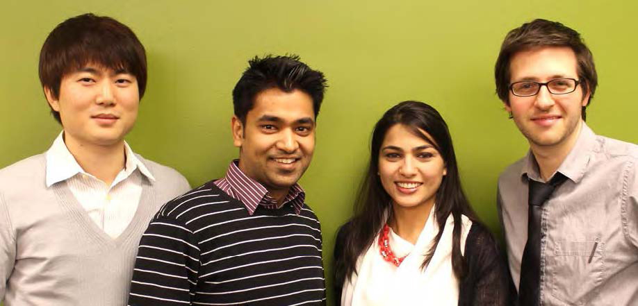 Our team (I’m on the right)
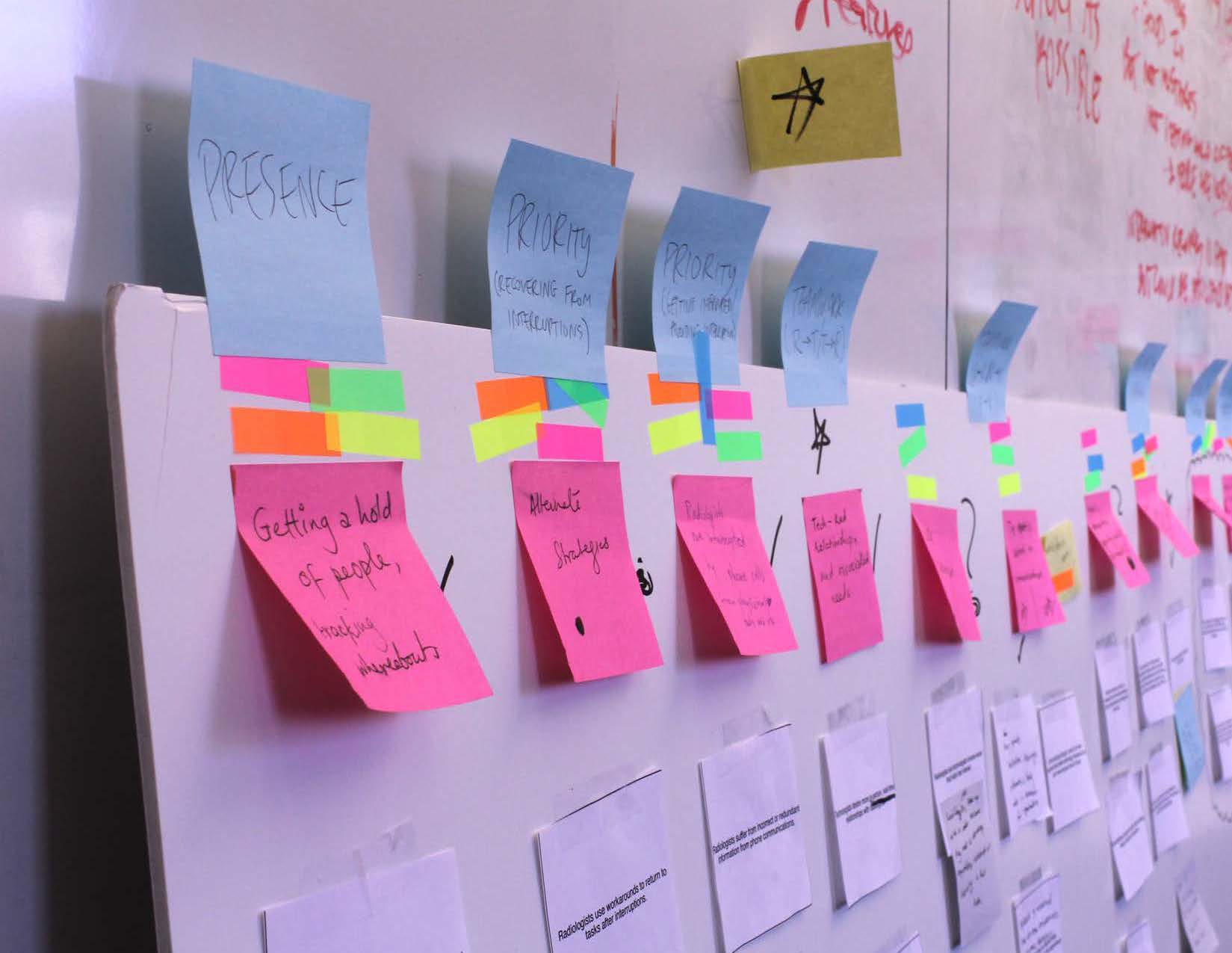 Categorizing our findings
 Envisioning solutions
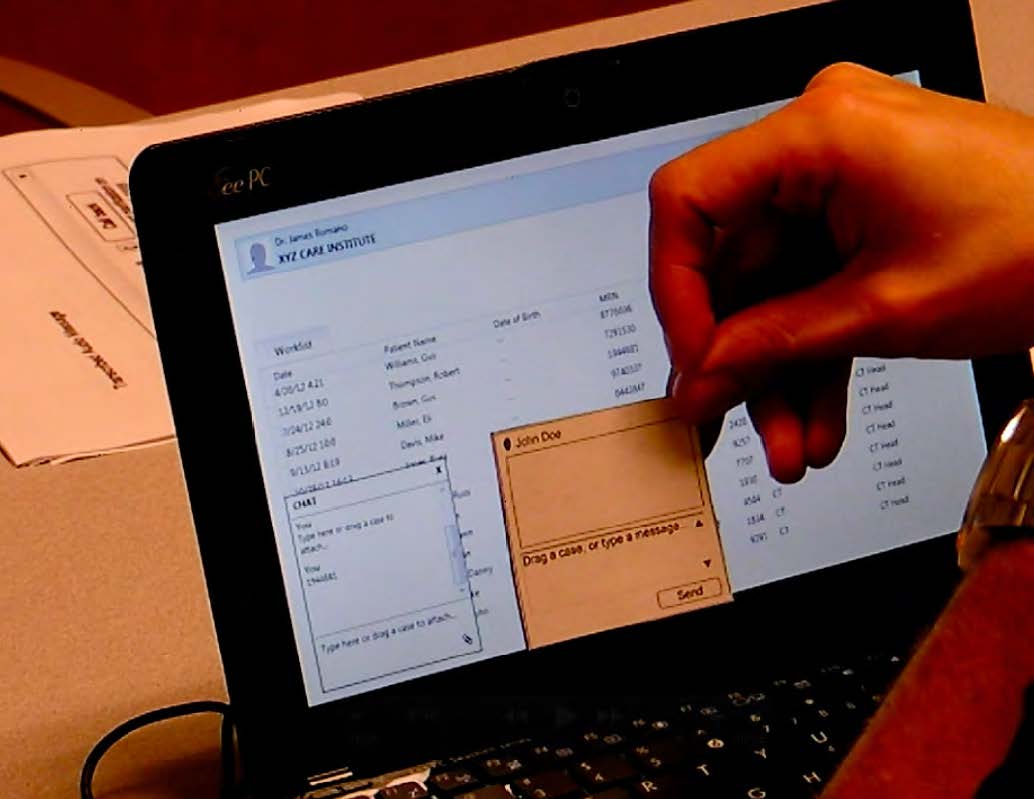
We watched radiologists spend each day in quiet darkness, tediously scrolling through images of their patients’ bodies in the hunt for visual abnormalities. Uninterrupted focus was absolutely essential. Radiologists depended upon two software systems which sat side-by-side on separate monitors—the RIS let them choose from a list of patients whose images await review, and the PACS let them scroll through images of the patient currently selected.

These systems were sold to hospitals as a package deal, including setup, technical support, and an ongoing sales relationship to stay current with the latest features and upgrades.
We observed that it would be to GE’s advantage to tie the distraction solution into the market-leading RIS and PACS systems that radiologists were all fixated upon every day. This would be a delicate operation, though. We were planning to funnel distractions through those systems—a single misstep could ruin everything that radiologists liked about them.
So, in our design process, we took great care to create a user-friendly product that would solve existing problems without creating new ones.
Radiologists are the smartest and most demanding users you could imagine. They come from a discipline requiring more study than most other tracks in medicine. They fiend for the newest and best technologies and spend all day masterfully completing complex interactions on multiple systems simultaneously. They are also extremely skilled at pinpointing problems—after all, it’s their job. So if you want to find a shortcoming of radiology software, cast a stone in any radiology department and you’ll hit a plethora of incisive observations.
 Getting worked up about tech
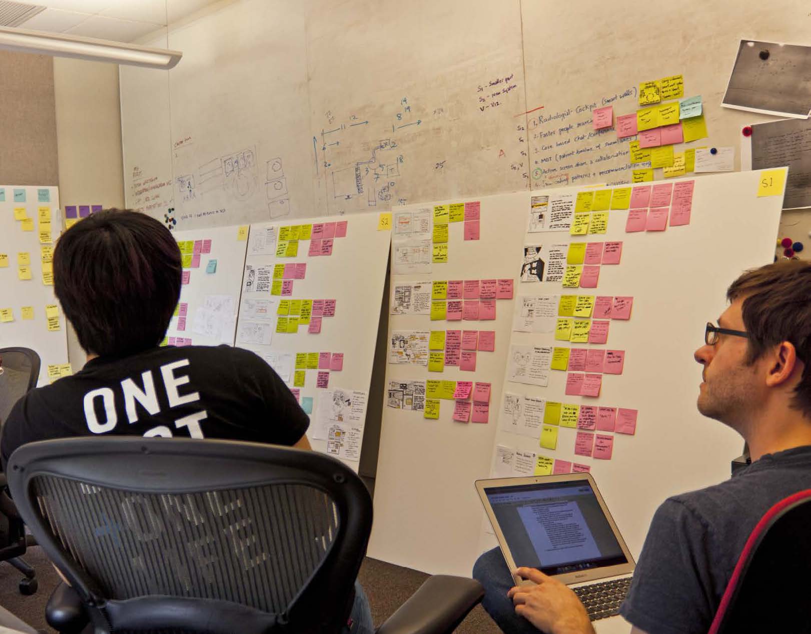
Our job, then, was to get out of the way and just listen. We took careful notes and figured out which problems were common, what bigger issues were at their roots, and how we could solve them. We built prototype after prototype, starting with paper and iteratively testing features and their interplay.
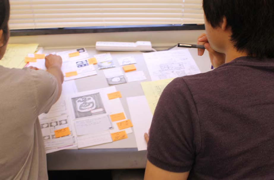 Starting with paper
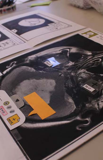
 Our Patient Card concept
 Streamlining our feature set
I love moderating tests. I could spend all day doing it. Luckily for me, I planned and executed every one of our tests with dozens of radiology professionals in hospitals and departments of all shapes and sizes.
 “Radiology: The Board Game”
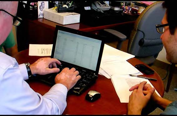 Testing in medium fidelity
 Mixed-media prototyping
 Testing in high fidelity code
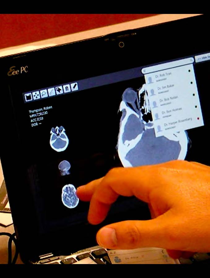
When the dust settled, we had usability-tested and developed a software prototype that demonstrated a vision for an integrated communication interface. Every step of the way, we had improved our designs with feedback from our GE mentors, faculty, peers, radiologists and their colleagues.
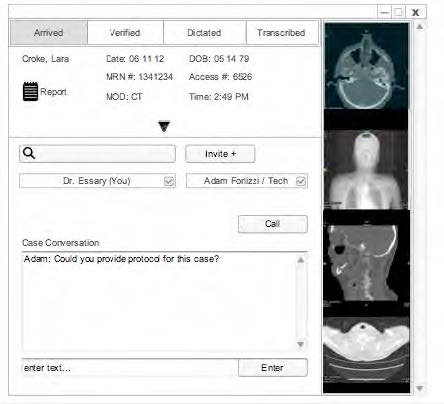
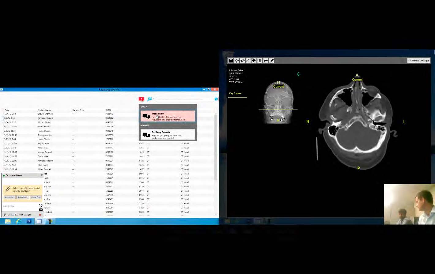
Our solution, Synaptic, was a real-time collaboration and priority-based communication interface integrated into a unified RIS/PACS system. Our interface gave radiologists the control and flexibility they needed to more efficiently connect with colleagues, conference around cases, and handle incoming requests.
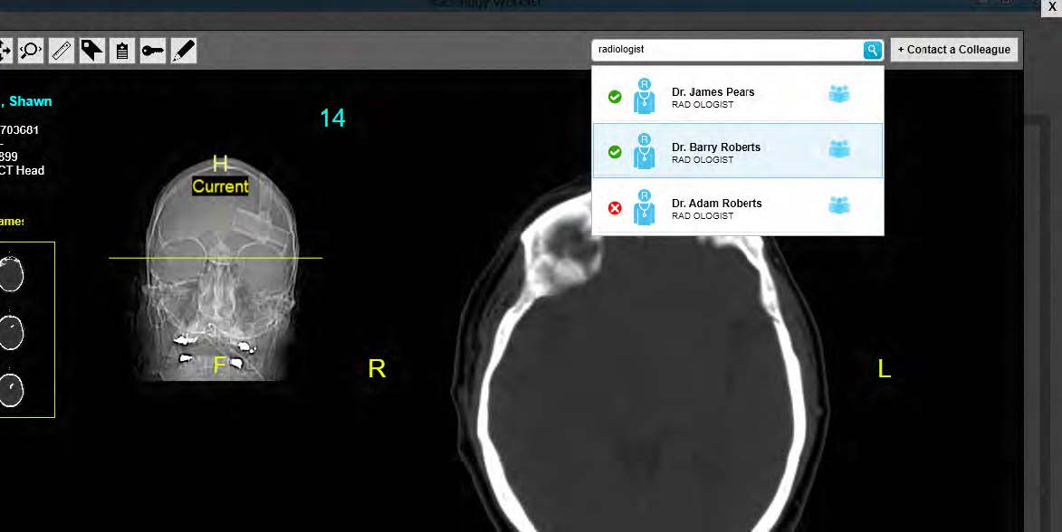 People search was a leap forward
Synaptic’s combination of synchronous and asynchronous communication tools supported radiologists’ communication needs while alleviating many of the workflow disruptions they were experiencing.
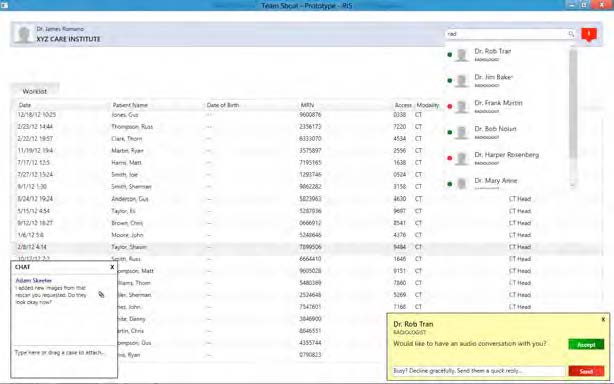 Minimally intrusive call-handling
Fortunately for us, we captured video of our users falling head-over-heels for Synaptic.

We presented Synaptic to GE as a vision for the future of radiology—with both the integrated RIS/PACS and unprecedented collaborative features.
 Moderating GE workshop
I was also my team’s editor-in-chief for Documentation.
The opinions expressed on this website and in its supporting documents are mine and do not represent the official position of any other party or company.
DIRECTV
Experience strategist
DIRECTV wanted customers to rave about its second-screen experience, but login rates at DIRECTV.com were dismal.
Web analysts recommended simplifying navigation for login and registration. Developers A/B tested multiple designs. This reduced the bounce rate during registration but left the deeper issue unresolved.
DIRECTV asked—what design changes would bring customers online?
Numbers don’t lie, but they must be carefully interpreted when supplied to explain human behavior.
Here, the numbers told us that customers weren’t logging in and didn’t always finish registering. DIRECTV saw some navigational obstacles and assumed that removing them would bring throngs of customers online.

But it didn’t. As I looked over the numbers, I realized that DIRECTV had asked the wrong question. Low login rates weren’t necessarily caused by bad design. What if the design had been adequate, but something deeper was wrong? What if customers weren’t properly motivated to register and return to the website?

I needed to catch customers at the moment they registered, and again when they were presented with the option to log in. By inserting a pop-up screener on those pages, I could offer customers a gift card in exchange for discussing their current experience with me over the phone. Fortunately, DIRECTV had used ethn.io pop-ups in the past to intercept customers, so I used them again.
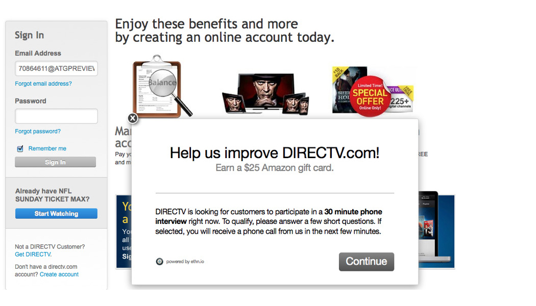 Fishing for insight
My pop-up screener filtered respondents down to a representative sample of the customer segments recognized by DIRECTV and its business, marketing, and design divisions. DIRECTV’s customers skew older and on average are less familiar with technology trends.

Even knowing this, the outcome of my study was surprising.
Over the phone, some customers revealed that they weren’t flocking to the website after registering because they thought that they had been registering their satellite dishes for warranty—not registering themselves for user accounts. They thought the website was a one-off, set-it-and-forget-it experience—not a gateway to service enhancements.
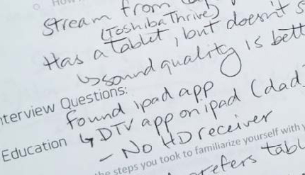 Surprising habits revealed
Other customers thought that the only time to register and log in was when they called technical support. They thought that going online while on calls would help phone technicians to pull up their technical statuses more quickly. As if DIRECTV were a perfectly interconnected, all-knowing cloud entity. Like the NSA, wink-wink.
Finally, most customers didn’t understand the value of going online. They were unfamiliar with features. They didn’t know how they worked. They didn’t buy DIRECTV for their computer devices, anyway—they bought it for their big screens.

And if they had kids or spouses who might get more out of the website, those relatives had to log in under the customer’s umbrella account. As you might imagine, a customer who doesn’t understand the value of your website is not the person you want in charge of dispensing user accounts. Talk about a “middle man” you’d want to cut, if only that same person weren’t paying for your services!
Numbers don’t lie, but there’s a lot they won’t tell you about. How users think. Why they behave as they do.
 Puzzling it out
Sometimes you start with a login problem and end up with customers who didn’t know they had one. Sometimes you investigate why customers register but never log in, and end up with an urban legend about omniscient corporations.
That’s where strategy and qualitative research are needed most. That’s where you want a user experience professional who gets people, and who’s always digging.
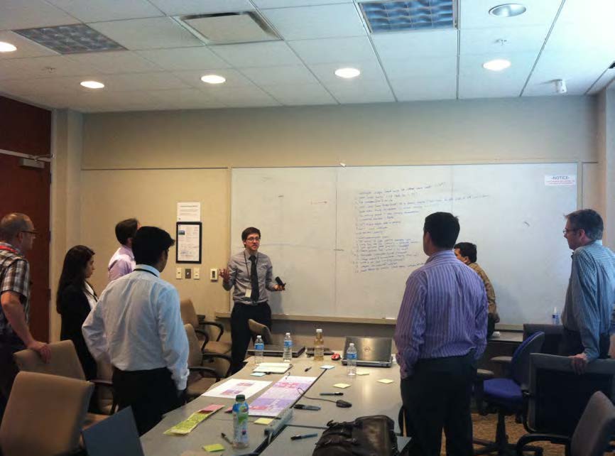
My research was combined with a colleague’s study on social login. We flew from Los Angeles to New York to present our findings and workshop solutions with DIRECTV’s web development team and executives of the Digital Entertainment Product Group—by the way, I love moderating workshops!
 Workshopping solutions
I produced a proactive report based on our combined work.
The opinions expressed on this website and in its supporting documents are mine and do not represent the official position of any other party or company.
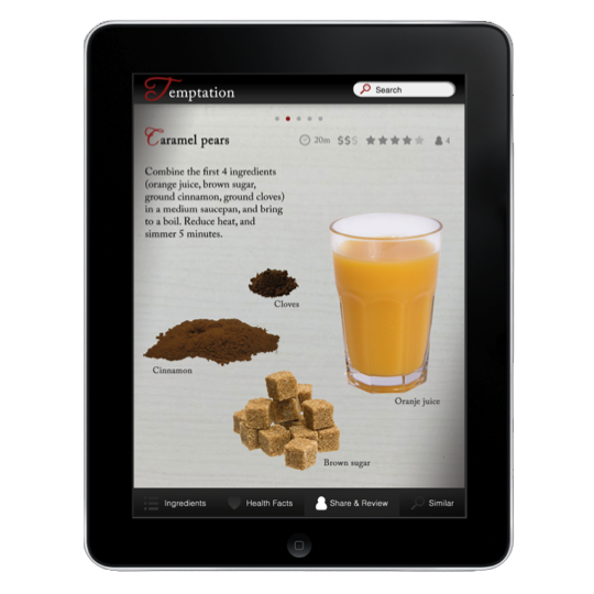
Temptation (independent)
Experience designer
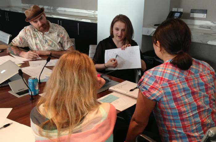
In the winter of 2011, I formed a team with two other graduate students in the Carnegie Mellon Masters of Human-Computer Interaction program. Our official mission was to visually design a dessert app for a class project.
But as budding user experience professionals, we had our hearts invested in making the world a better place. We didn’t want to design a pretty app that nobody needed.
So we devoted hours to a market analysis of recipe apps, cooking websites, and print magazines. When the dust had settled, we saw a gap in the app market—sophisticated home cooks had no app tailored to their needs.
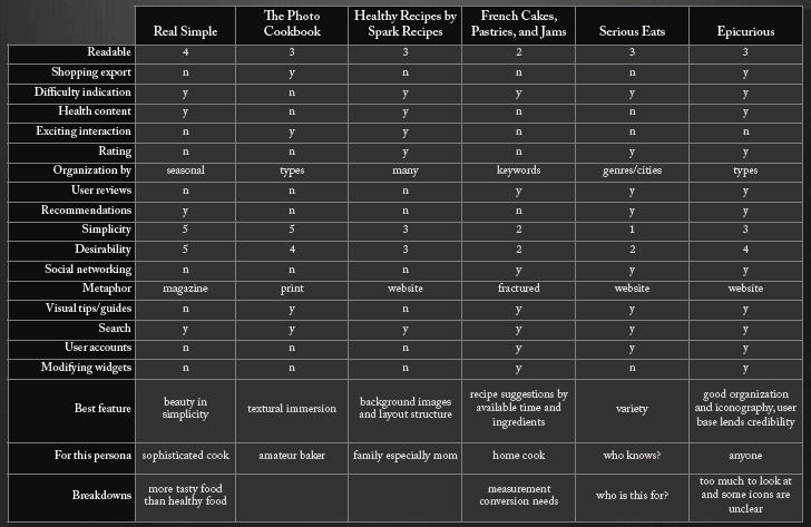 Revealing an app gap
We envisioned the perfect app for a sophisticated home cook to use in the kitchen. It would be an interface that combined magazine print’s beauty with the iPad’s customizability. We set about bringing our vision to life.
When beginning the design process, it is extraordinarily important to understand your users. However, you can’t respond to the unique details of every user’s situation. You must sift through those details to uncover the common threads, shared by all users, that are meaningful in the context of your endeavor. It is helpful to reassemble those threads as a smaller, fabricated set of representative users which we refer to as personas.
You may be familiar with market segments, which are similar to personas in that they reduce many customers to a small set of demographically related ones. This is great for marketing because it is convenient to sell to specific demographics. However, in design, we use personas because users’ needs often cross demographic boundaries with no causal link.
Ideally, personas are drawn from primary or secondary user research. Primary research consumes the most resources and time—secondary research consumes fewer resources but doesn’t happen overnight. We weren’t given the luxury of time or resources, so we were forced to draw our personas from past experience. I find that it’s better to refer to roughly drawn personas than to none at all.
 Three gourmet personas
We established three personas—busy working mom Nora, wealthy bachelor Clarence, and fashionista Astaire. Despite differences in their lifestyles, ages, and genders, the three were all gourmet afficionados who dreamed of crafting exquisitely beautiful dishes in their own kitchens.
Inspired by our personas, we collaged a mood board from which we derived our color palette.
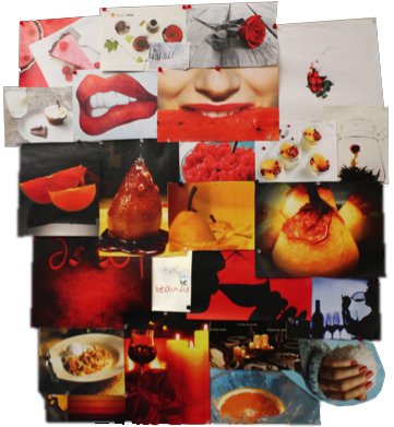 Mood board—collage
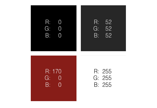 Color palette
Several typography samples later, we had our design elements and were ready to sketch.
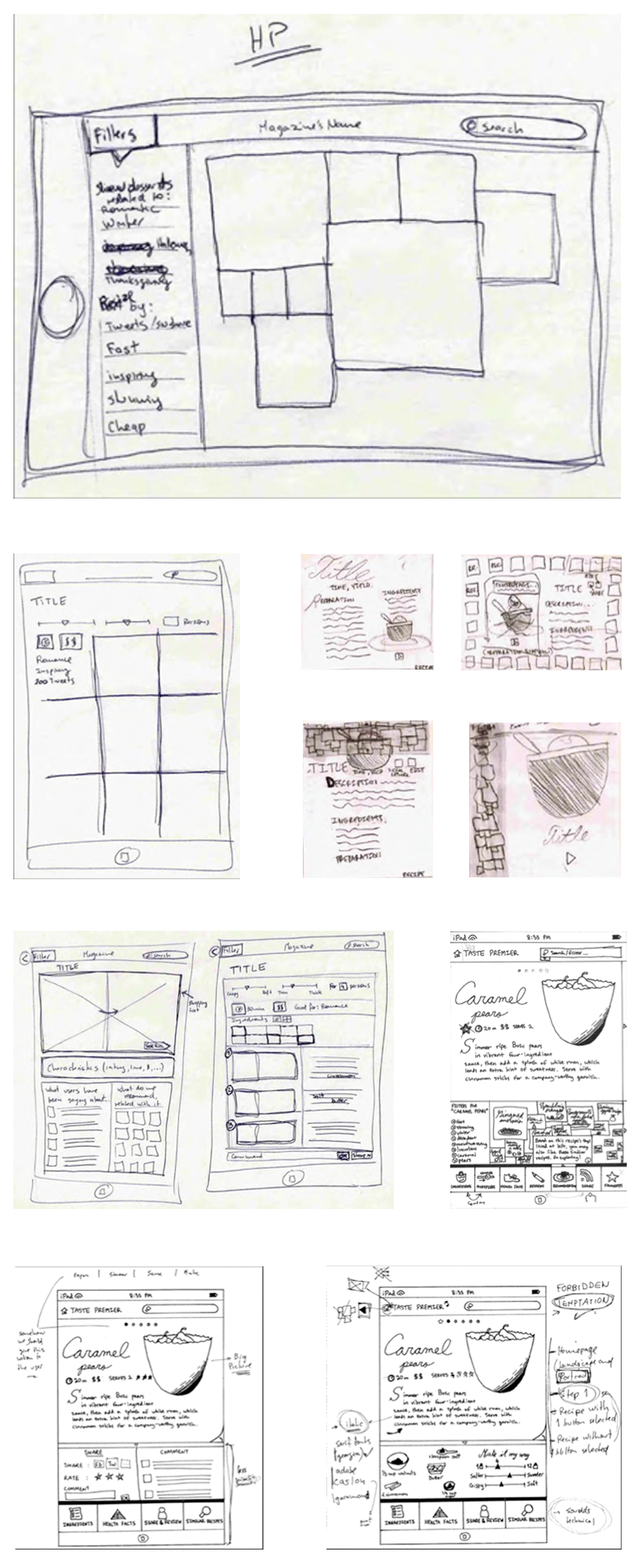 Sketching the interface
Over many iterations, our hand sketches came together into a single design direction. Our team sketched both independently and in a group setting, bouncing ideas off of one another. We then moved to the digital space, working primarily with Adobe Photoshop.
 Refining digital sketches
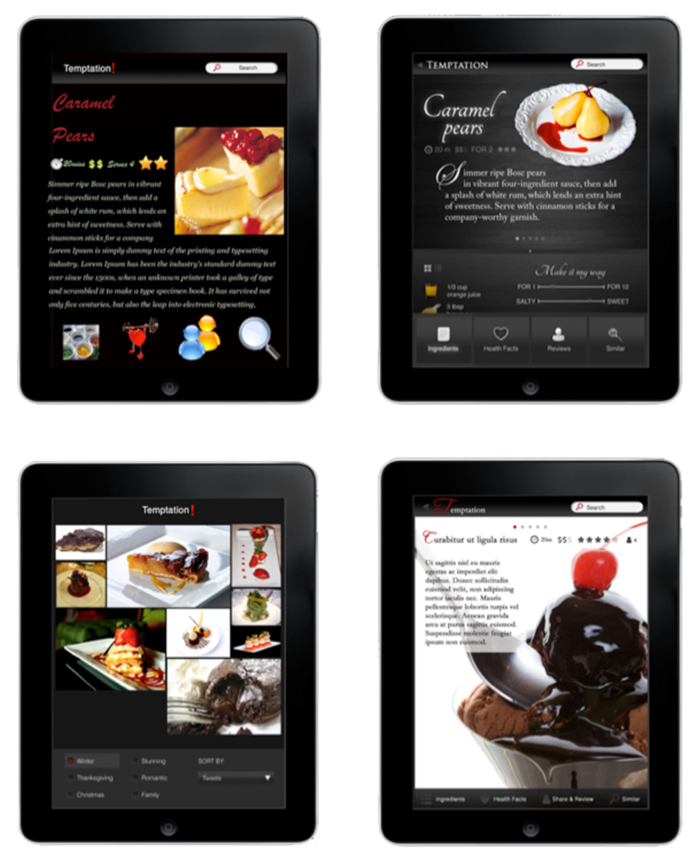
We made several small changes on the way to our final designs. Our primary goal was to unclutter the interface as much as possible. This would provide both a pleasing experience and clear navigational flow for users who might not be technical experts and would be using the swipe function in the kitchen.
We wanted users to be able to start exploring from the moment they opened the app, so we created a home page that featured trending recipes in a Pinterest-style layout. If the user had recently viewed recipes, then the ones on the home page could be similar to those.
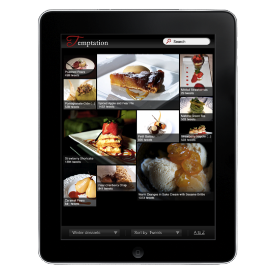 Instantly browse trends
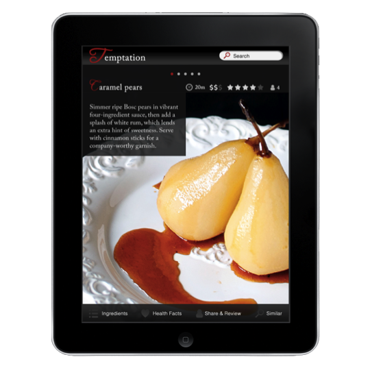
Our earlier design iterations had provided the user with half a dozen options per page—in testing and critique sessions, we learned that this many options would overwhelm the user, so we reduced them to just a few and focused on beauty and minimalism. Drawers fixed at the bottom of each recipe page kept ingredients, health facts, sharing and browsing options one step removed from center stage.
We paid attention to small details in each recipe. Each step featured large, beautiful images of the ingredients, to keep the work of cooking from feeling tediously technical.
Like a good recipe magazine, we wanted our app to serve as an aid not only to the cooking process but also to the experience of cooking a gourmet meal.
 Gourmet user experience
 Beautiful but simple
At the same time, like a well organized website, we wanted our app to provide a satisfying browsing experience, compelling users with limitless variations of any given recipe.
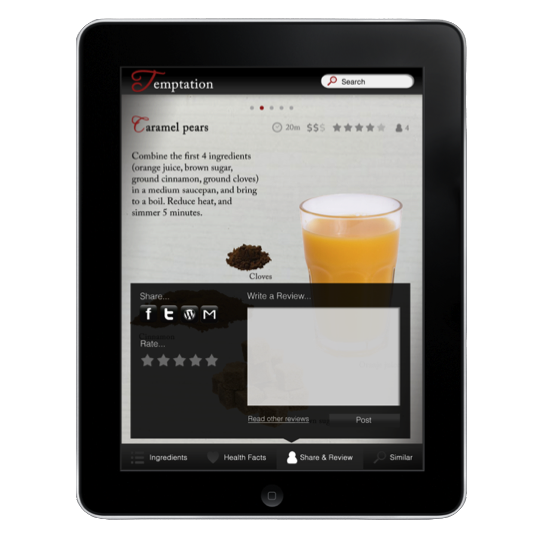 Usable and functional
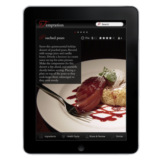 Find similar recipes
At our design presentation to the community, Temptation was a great success. While we couldn’t continue the project because of our other academic responsibilities, I look back fondly on our designs. Four years later, they serve as a reminder that when evoking luxury, less is more—even in user experience design.
The opinions expressed on this website and in its supporting documents are mine and do not represent the official position of any other party or company.

The Philadelphia Zoo
Experience designer
The zoo for me is a place to contemplate human-ness and to imagine alternatives to experiencing life as we do. I believe the zoo offers every visitor enormous potential for imaginative and empathetic experience, but is the potential fulfilled?

For years, zoo apps, kiosks, and even games have been designed around technology. Of course, things should be the other way around—the technology should be designed around the experience, especially in an environment rich with biodiversity.
A paradigm shift was needed. We had to shift from information-dissemination to heartfelt, active learning. We needed to engage visitors with compassionate comprehension. Live-action games where visitors could role-play as animals would make this possible. These kinds of experiences would harness emotion and physicality instead of resorting to the same old "cutting-edge technology" sales pitch or dry information dumps.
Role-play is fun and enlightening, and can be integrated in degrees of subtlety into an experience. Animal role-play presents a unique opportunity to inject human experience with a sense of empathy, comprehension, and compassion for animals. I thought I might take my design in that direction. Others had integrated role-play in the past—but how successful were those experiences as a result? I dug deep to find similar experiences and discovered that some did better than others.

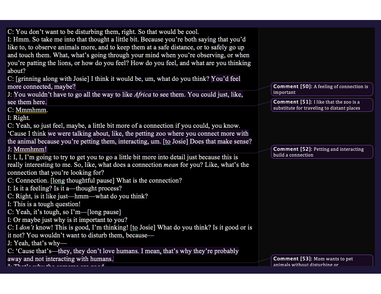
Using the above scale of ten metrics as a guide, I began to plan a completely new kind of design. I established the Philadelphia Zoo as my target client and filmed interviews and observation sessions at the zoo with three families including children and women 25-35—the prime demographic according to the Association of Zoos & Aquariums.
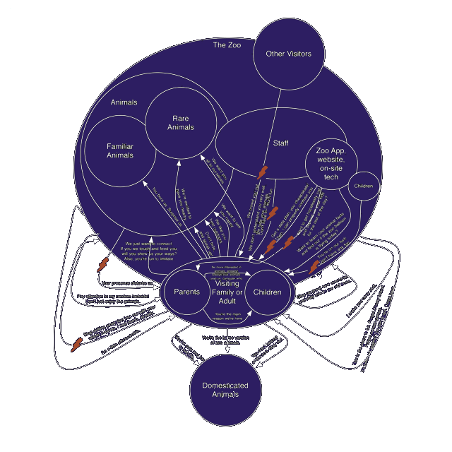
Transcribing the footage, I found 177 raw insights, which I consolidated into contextual models of the common activities and perceptions of all participants.
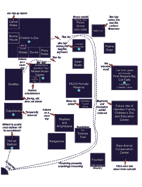 Where everyone goes
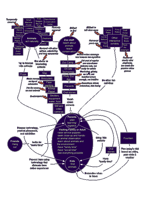 What everyone says
 What everyone thinks
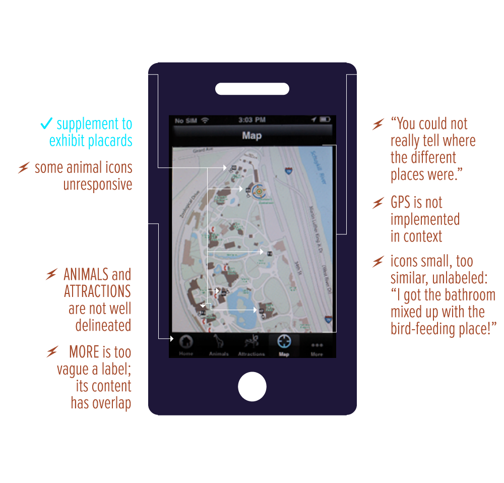 Bonus: zoo app issues
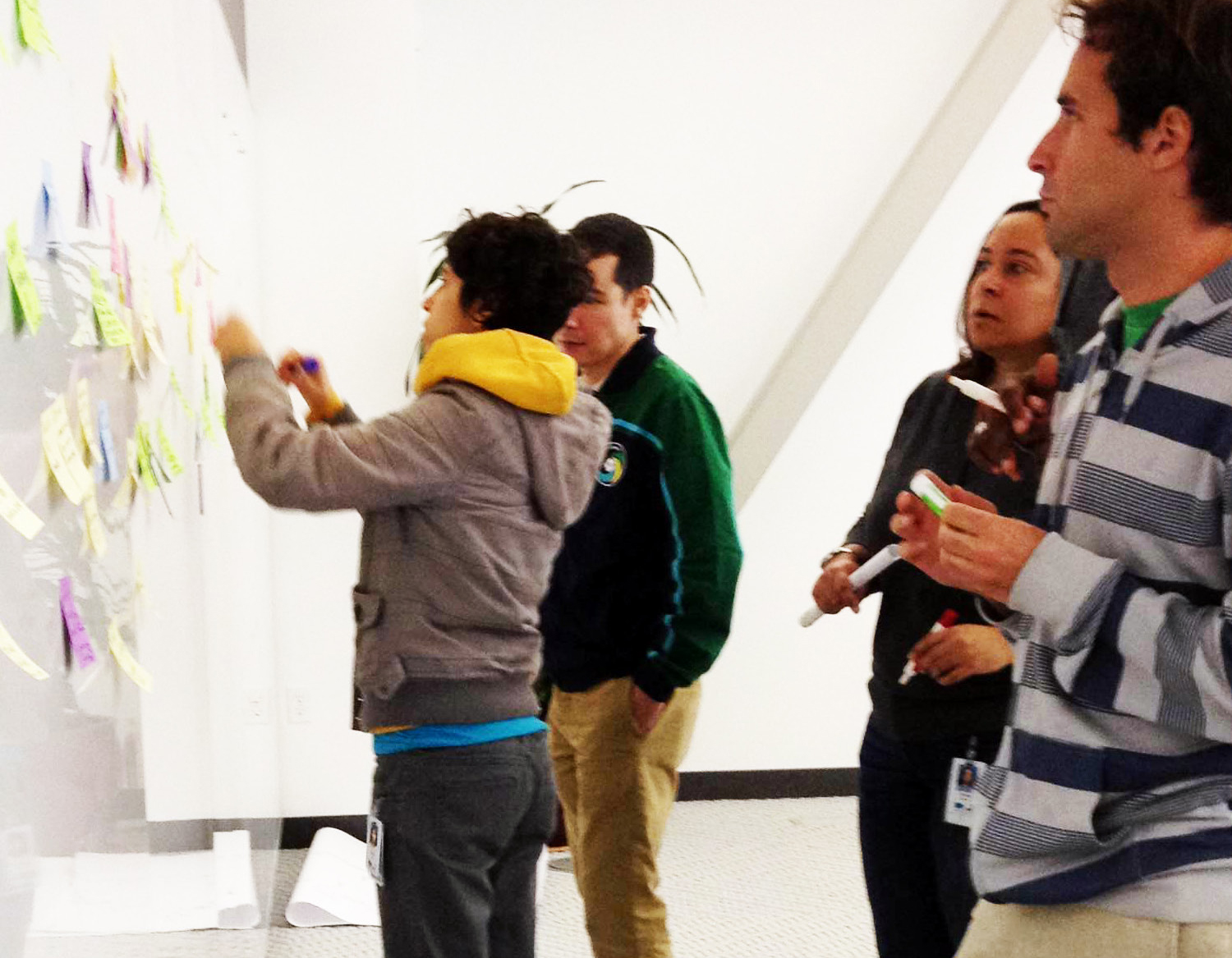
Data speaks a cold-blooded language. I needed to translate my data back into direct, compelling statements of visitors’ desires, so I organized their comments into an affinity diagram.
 Affinity stickies from a distance
I found that on the positive side, my participants cherished unique opportunities to observe, imitate, and understand animal traits and behaviors. For example, the Philadelphia Zoo’s Lorikeet Experience was animal interaction at its finest.
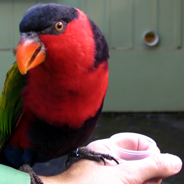 Lorikeet Experience
 Transcripts: guests want to connect
On the negative side, participants felt that on-site technology and some exhibits were not adult-friendly or interactive enough, and worried that they distracted from engagement in the zoo experience and development of interest in animal welfare.
Inspired by the common desires and themes I unearthed, I brainstormed twenty possible design solutions. Some were new services, while others were improvements to existing ones.
 Sifting through solutions
Comparing the potential impact of each brainstorm to its achievability, I integrated several brainstorms into a composite solution. AnimalConnection would be a suite of interactive, sensor-enhanced, animal role-play experiences.
Zoo visitors have a strong and unmet desire for empathetic experiences among the current sea of exhibits, on-site technology, and mobile apps that focus on factual learning and conservation. But it doesn’t have to stay that way—today’s technology allows us to augment and manipulate our experience of reality in ways that can simulate animal experience.
We need only combine smartphones or inexpensive Arduino processors with environmental sensors that detect changes in light, sound, motion, and other physical elements. Sounds can be altered in real time, lights can be triggered, and entire systems can be set in motion by the flick of a finger or the step of a foot. With some creative experience design, an inconspicuous space can be transformed into a pseudo-habitat for human exploration.
I created a suite of immersive games with sensors, and my bat experience moved testers to empathize not only with bats but also with the blind. Here’s an overview of the design:
A participant enters a pitch-black space holding a sensor that transmits different audio or haptic feedback corresponding to the participant’s distance from obstacles, prey, and her cave.
The participant is briefed on the details of her scenario: She is a Mexican Free-tailed Bat who has just given birth and must leave her cave in the Guadalupe Mountains to find a flying insect to eat so she can make enough milk to feed her baby upon return.
The participant learns that Mexican Free-tailed bats leave their babies together in communal roosts, and each mother can find her baby by listening for its distinct cry. The participant hears her baby cry out and is instructed to remember how it sounds so she can later find her baby. Then, without the aid of vision, the participant uses her handheld sensor to navigate the space, finds an insect, and returns to her baby.
At each step, the participant triggers a sensor, prompting congratulations and additional factual information explaining her situation and how it corresponds with a real Mexican Free-tailed Bat’s.
Congratulations and instructions are in second-person after the popular Choose Your Own Adventure series of books, e.g., “You are a Mexican Free-tailed Bat!”
At the conclusion of the experience, the participant is presented with a stuffed baby bat and told, “Take good care of her every night.”
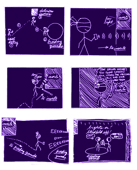 Napkin-sketch storyboard
Running with my initial storyboard, I tried to build a working prototype for the sensory components of the experience.
With no prior experience in this area, I borrowed an Arduino Duemilanove and a rangefinder from my friend Ryan Rusnak. Ryan had previously set these up as an “ultrasonic cane.” This device would allow the bearer to convert local objects’ distances to haptic pulses by pointing it around his vicinity.
However, Ryan was having some issues getting the system to work in practice; he invited me to take a shot, offering to let me use the system as part of my prototype if I could get it working.
After much fussing with parts and code, a little electronics engineering expertise from Asim Mittal, and some fleeting moments of success, I learned the real problem: the system was not physically robust enough to return reliable values from the sensitive rangefinder.
With little time remaining, I chose to scrap the Arduino plan and instead try something completely different. I would simulate the experience using a technique known as Wizard of Oz.
Wizard of Oz is a game of make-believe. Human agents masquerade as an intelligent system, performing its tasks without revealing themselves to the user. This allows evaluators to pretend a system is capable of more advanced actions than its current implementation permits.
In this case, the proposed system of sensors is absolutely feasible with modern technology. Wizard of Oz was used purely as a failsafe maneuver under time constraints.
One crew member paced back and forth to simulate a flying insect. Two others clacked percussive instruments to approximate the sounds of Mexican Free-tailed Bat babies. I used a handheld, stylus-operated, electric keyboard known as a Stylophone to provide participants with auditory feedback (rather than haptic) corresponding to distance from obstacles, prey, and the cave.
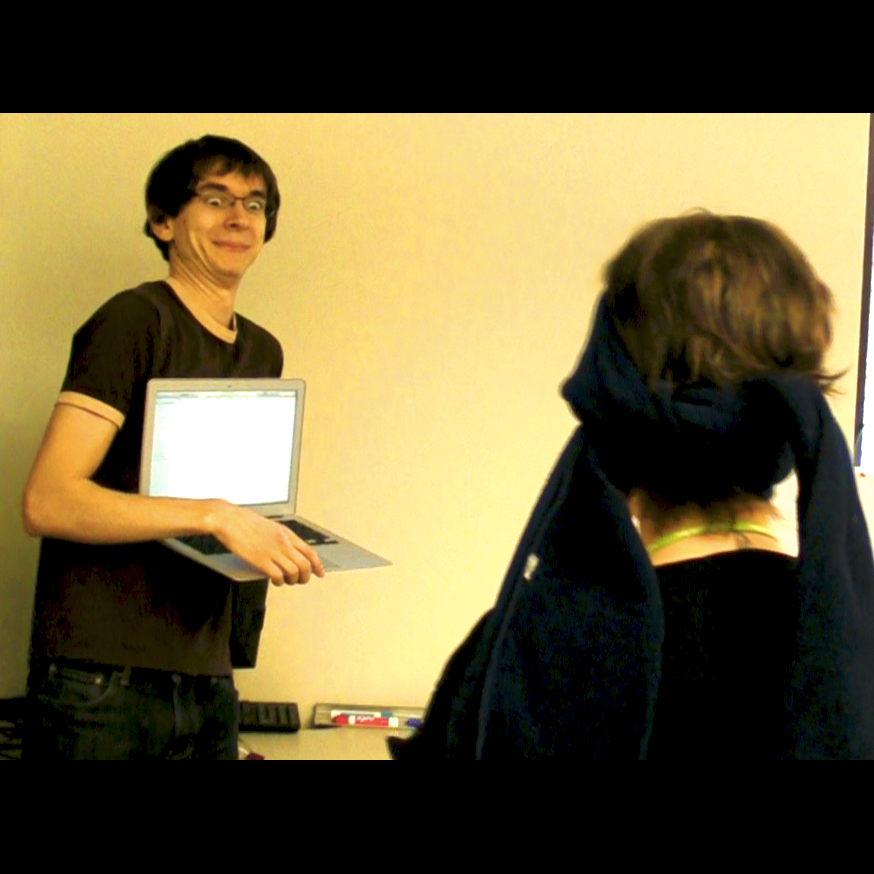 Joe, our “flying insect”
An instructional audio recording played on a laptop. My lab’s dining area represented the cave, and an adjoining office represented the outdoor environs of the Guadalupe Mountains. The participant was handed a disabled iPhone after being blindfolded, was led to assume that it was enabled with distance detection, and pointed it around for auditory feedback.
I recruited one woman (29) and two children (12 and 16) to interact with the experience. During Wizard of Oz, I encouraged participants to Think Aloud—to describe their actions and feelings as they navigated the experience.
Participants favorably evaluated the experience during Wizard of Oz and retrospective interviews. The experience achieved notable success along the indices of my effectiveness analysis matrix. Participants smiled and laughed throughout the experience despite abbreviated training and spatial limitations, often even misinterpreting related difficulties as intentional role-play elements. Participants said the experience contained a desirable balance of information, instruction, and facts, and that narrative immersion added meaning for them. The Choose Your Own Adventure narrative style was also a hit.
After Think Aloud and retrospective interviews, I compiled participant feedback into Usability Aspect Reports (UAR’s) to evaluate the current iteration of the design and to inform future iterations.
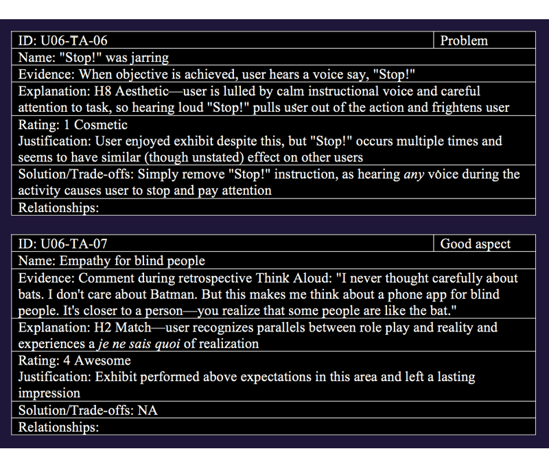 Sample UAR’s
AnimalConnection combines fun and learning in viscerally felt ways, giving visitors the connection they long for while using technology unobtrusively.
Because experience can be a more effective teacher than lecture, animal role-play exhibits can more directly affect visitors’ long-term knowledge of animal facts and concerns about conservation (Davey, 2006).
The contextual research underlying AnimalConnection also better positions it to help increase patronage. (See Works Cited in the below brief: Morgan & Hodgkinson, 1999.)
Even in prototype form, AnimalConnection outperformed its brethren within nearly every metric—and left participants talking. “That was unlike anything I’ve ever experienced,” said the 16 year-old girl with eyes wide. Meanwhile, the 29 year-old woman exclaimed, “It makes you realize that blind people are like the bat.”

